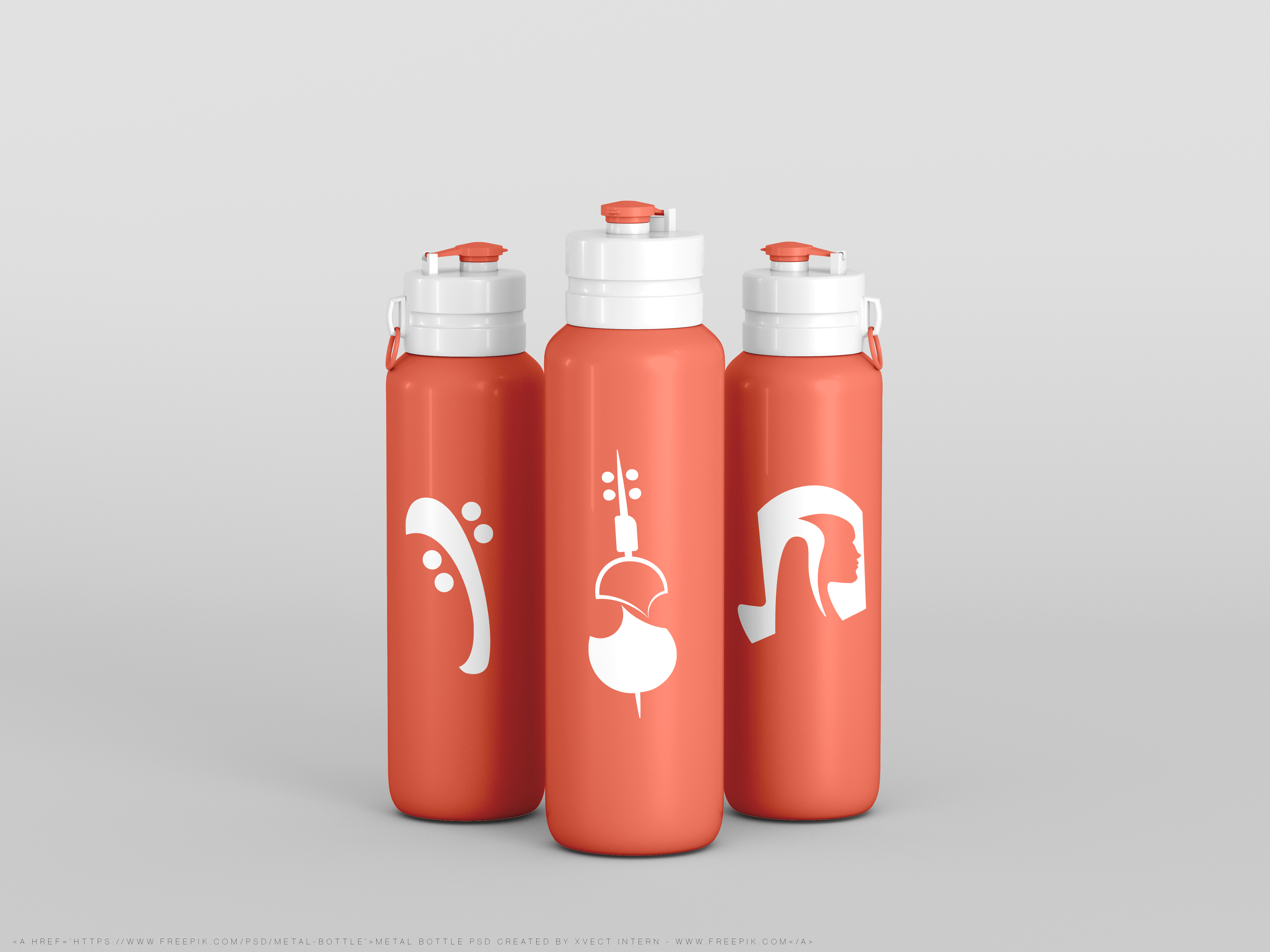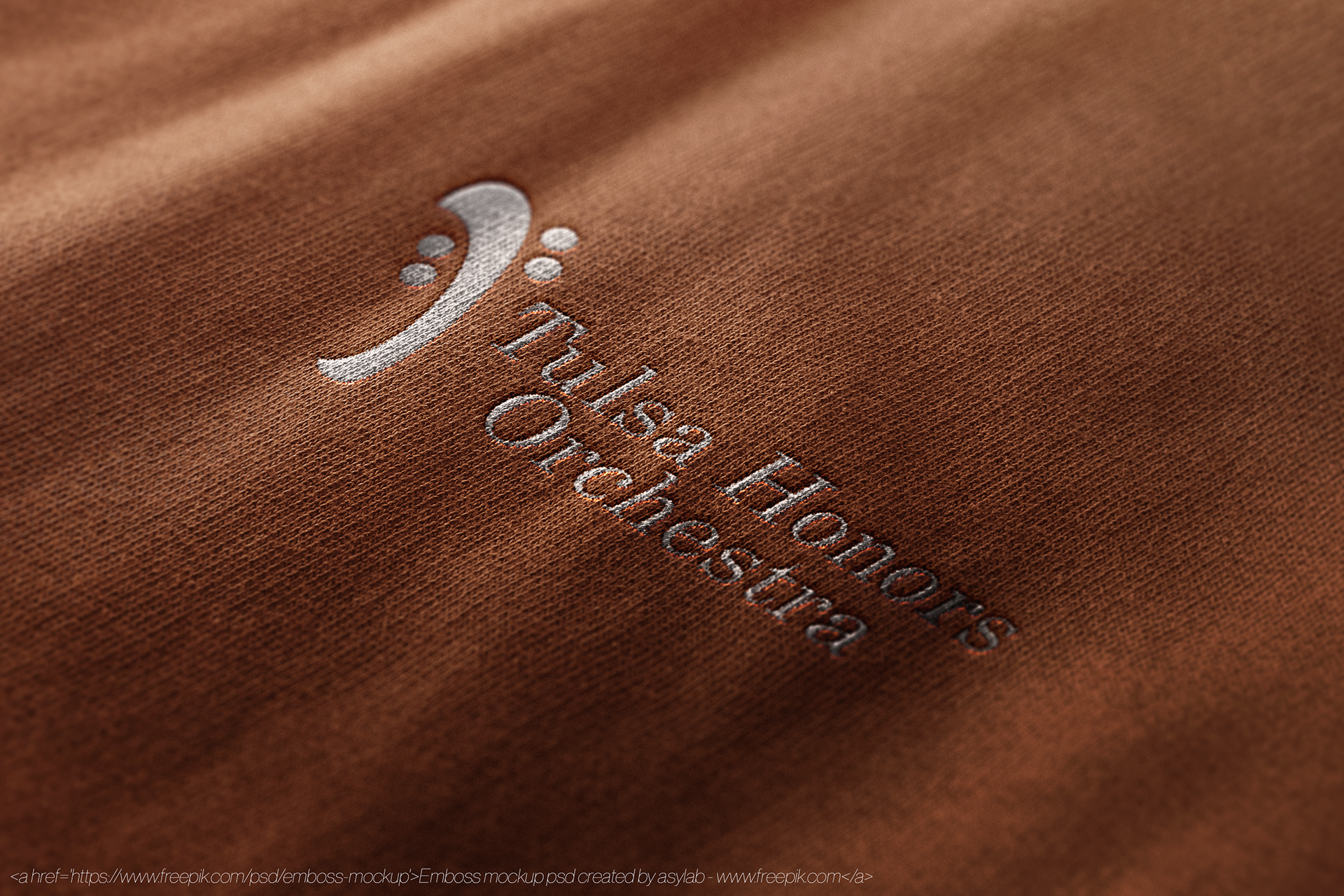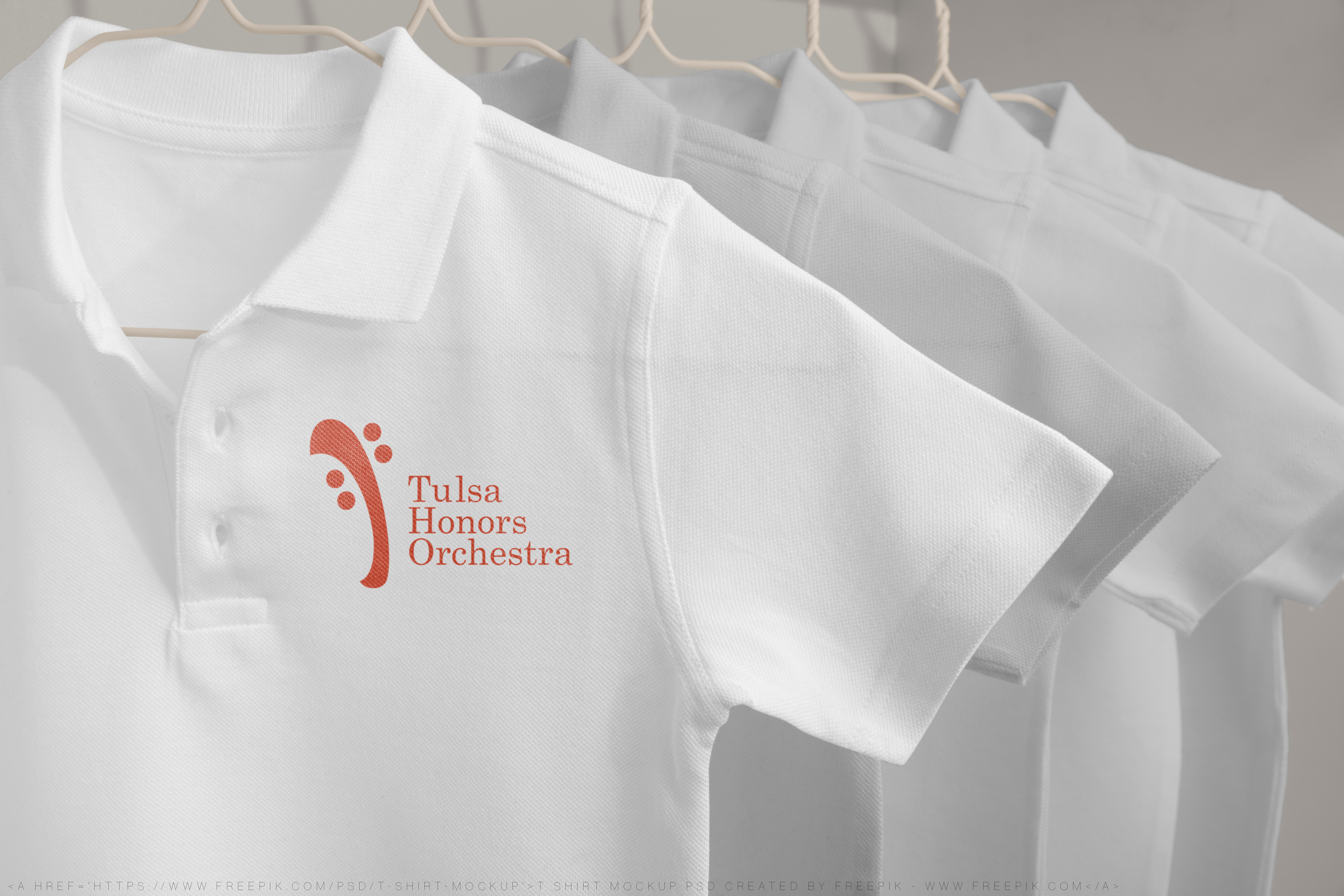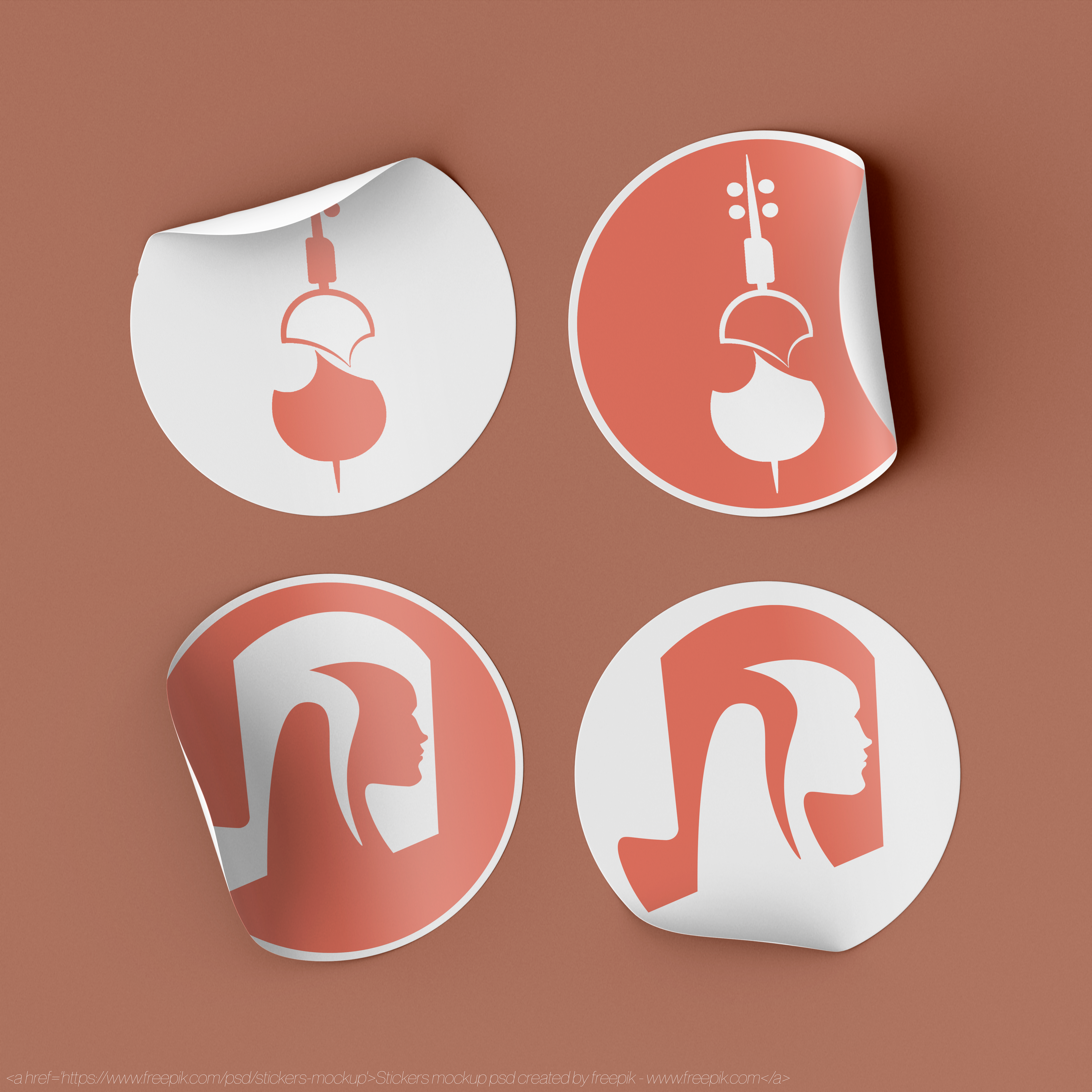
Tulsa Honors Orchestra Logo Design
A logo is an icon that represents a company, organization, or a person and it is the keystone of branding. Ideally a good logo should be eye catching, timeless, memorable, and accurately represent the company behind it. A logo first needs to have a good concept, so for this project I explore designing 3 different concepts for Tulsa Honors Orchestra’s logo. Approaching each design with a distinctive conceptual approach, those being abstract, representational, and expressive. I’ve limited myself to a single color to focus more on shape and form when designing these logos
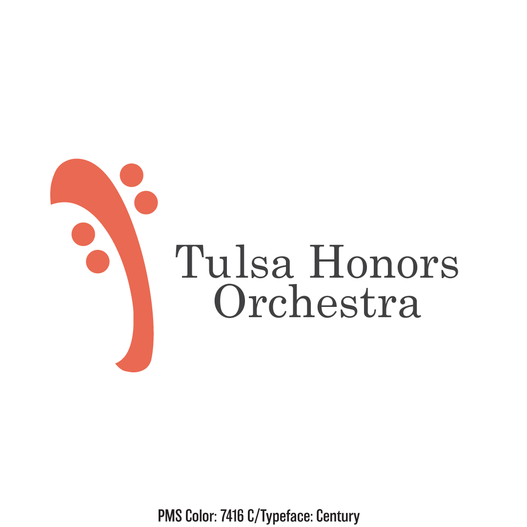
Abstract Logo
If an image is worth a thousand words, an abstract image might be worth three thousand. Abstract logos are a popular choice for many modern brands. With geometry and simple shapes, you can keep a logo timeless. An abstract logo is essentially giving visual shape to an idea.
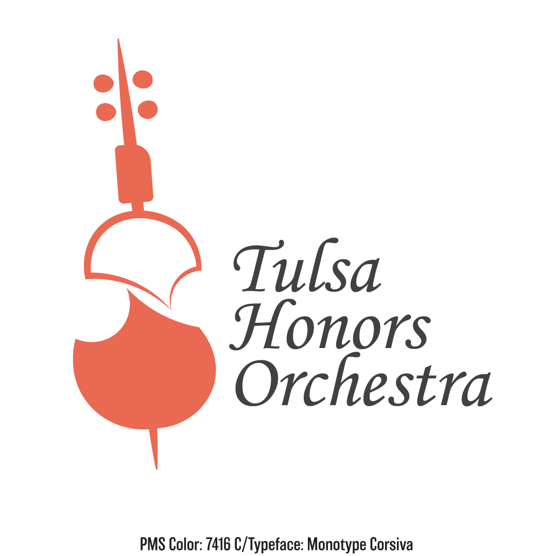
Representational logo
Representational logos stylize recognizable objects to produce icons that clearly communicate what they represent. It’s important to consider what objects can be stylized to best represent the brand. In this case a stylized representation of a string instrument would best represent the Tulsa Honors Orchestra.
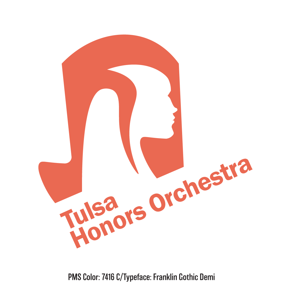
Expressive logo
Expressive logos explore graphic stylizations of icons that communicate the essence of a subject. Expressive logos can be abstract or representational, but the goal of an expressive logo is conveying nonphysical concepts such as speed, sound, and emotions. This Logo is expressing the concept of music and sound with the use of the musical note, and it’s expressing emotion as well with the silhouette of the face.