
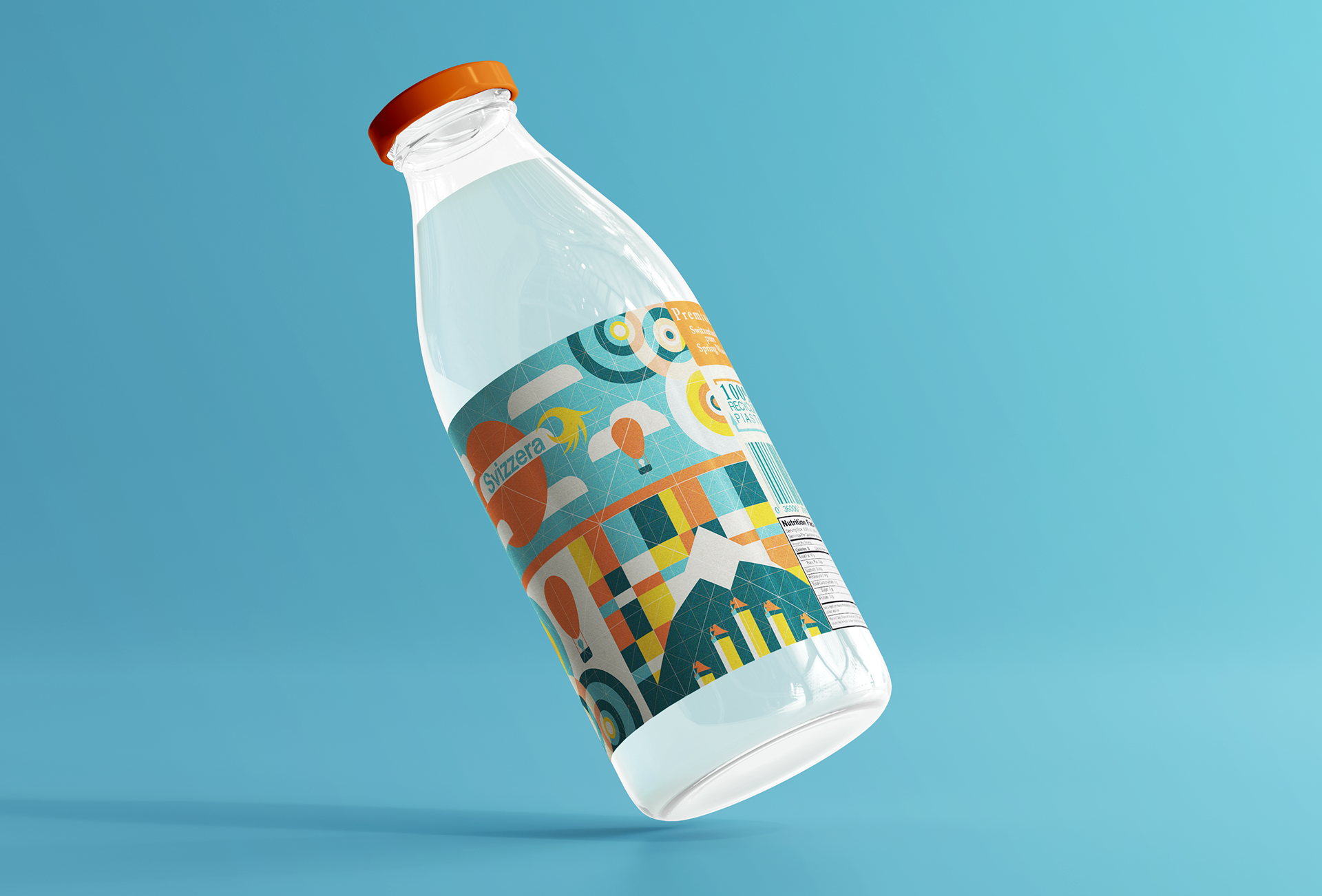
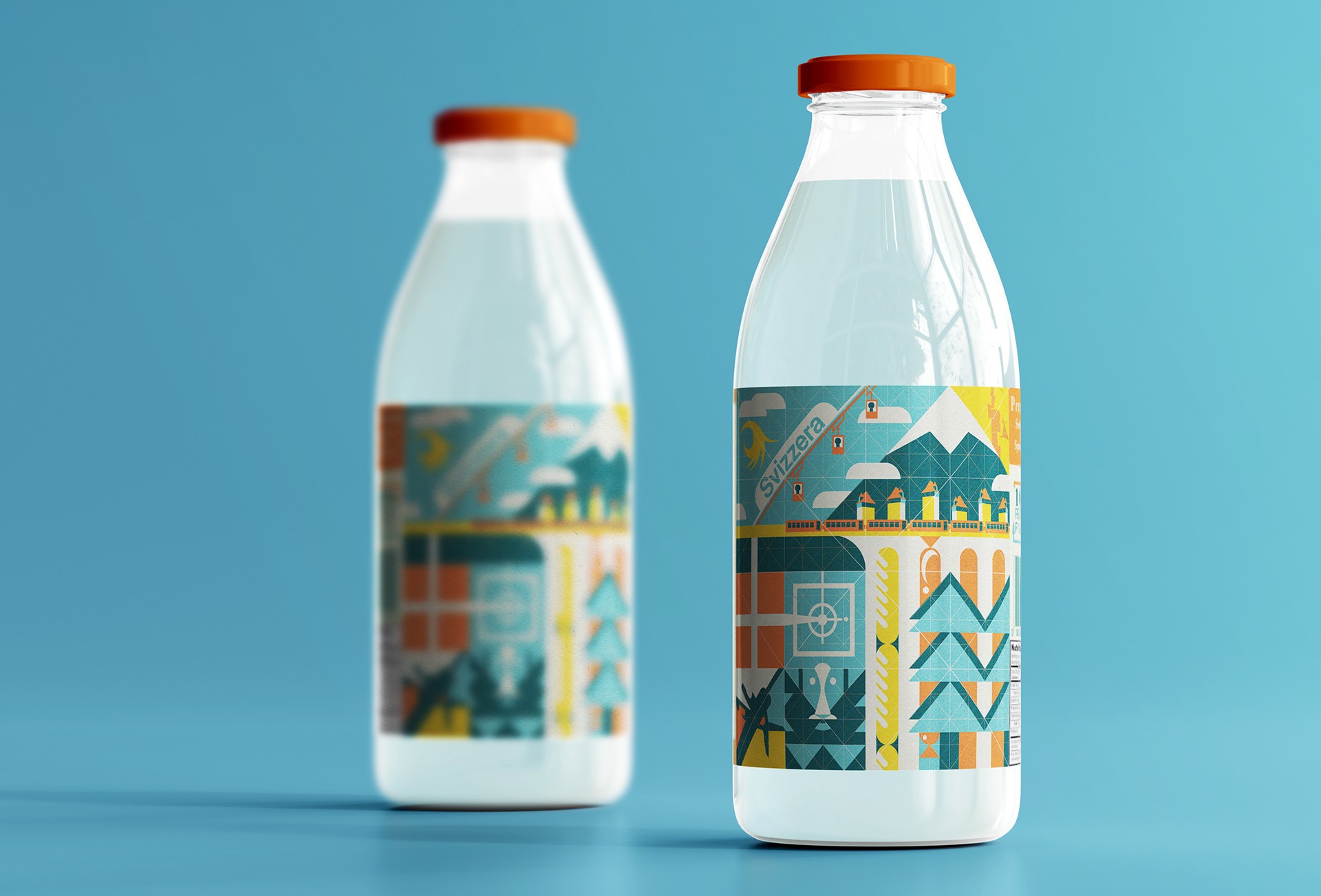
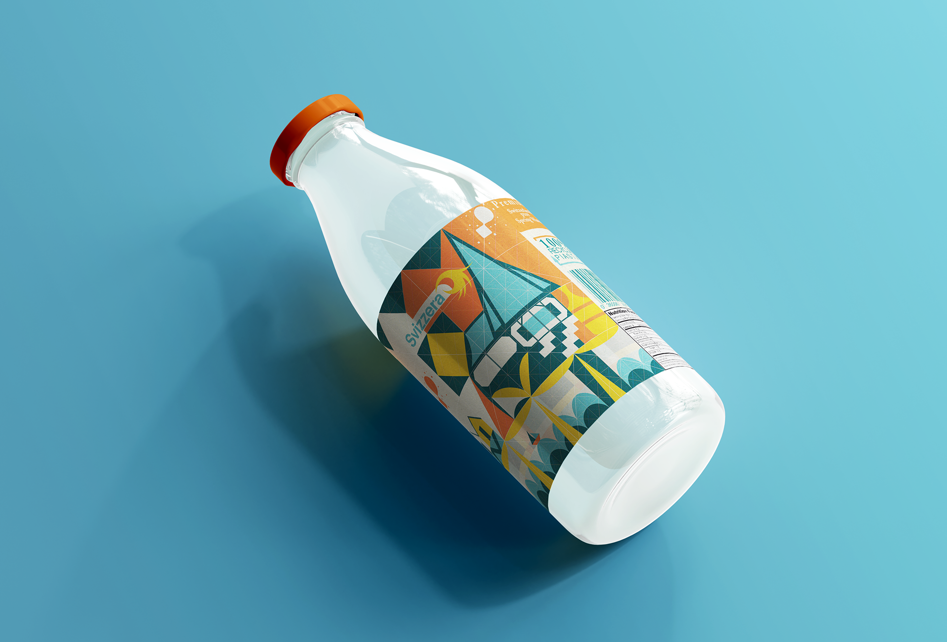
Svizzera Packaging Design
Svizzera is a fictional brand of high quality bottled mineral water. The company is based in Switzerland and their source of water comes from a natural spring in the Alps Mountains. The high-quality source is complemented by high quality packaging. Delivered in a glass container accompanied with detailed illustrations that pay homage to both the beautiful Switzerland landscape and their rich design history. The water doesn't have any extra chemicals added, only the natural minerals from the spring. The objective for this project is to create a series of cohesive vector-based package designs that will stand out amongst the crowd on store shelves.
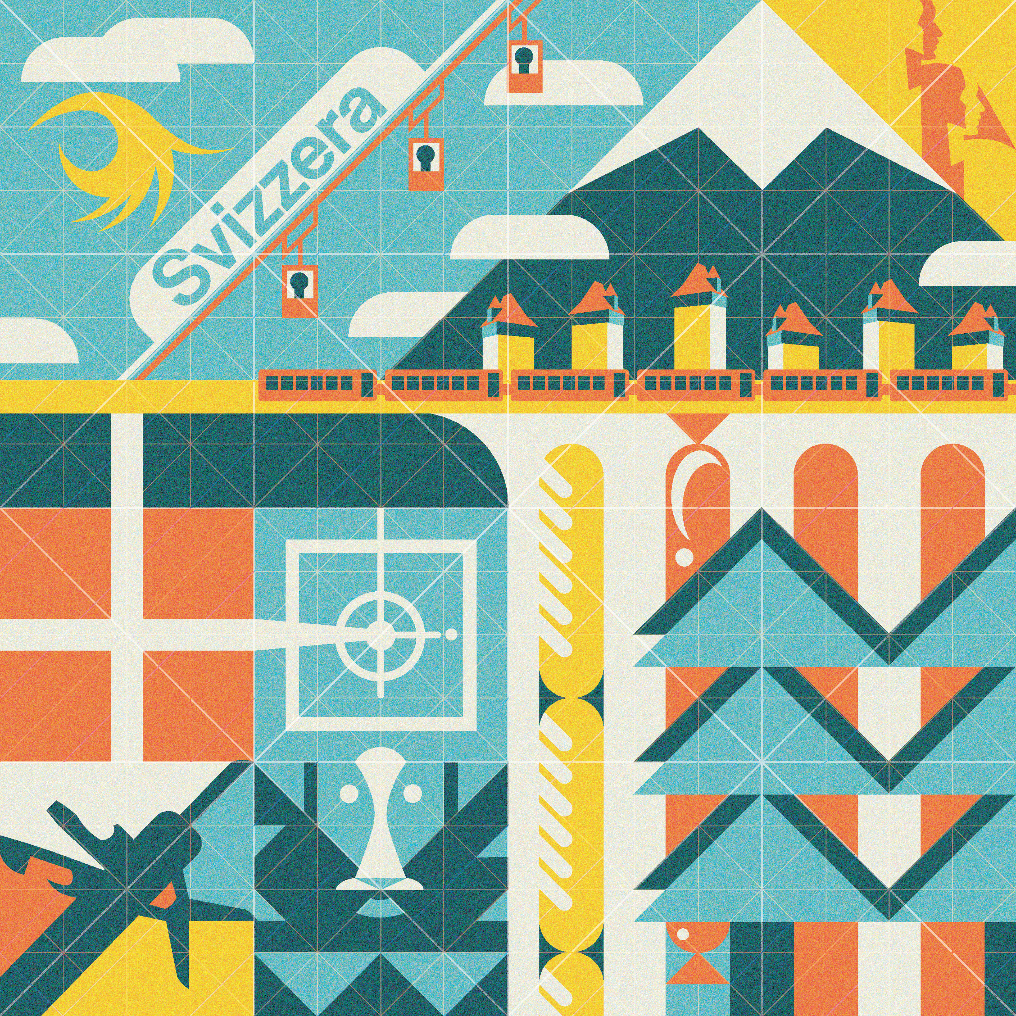
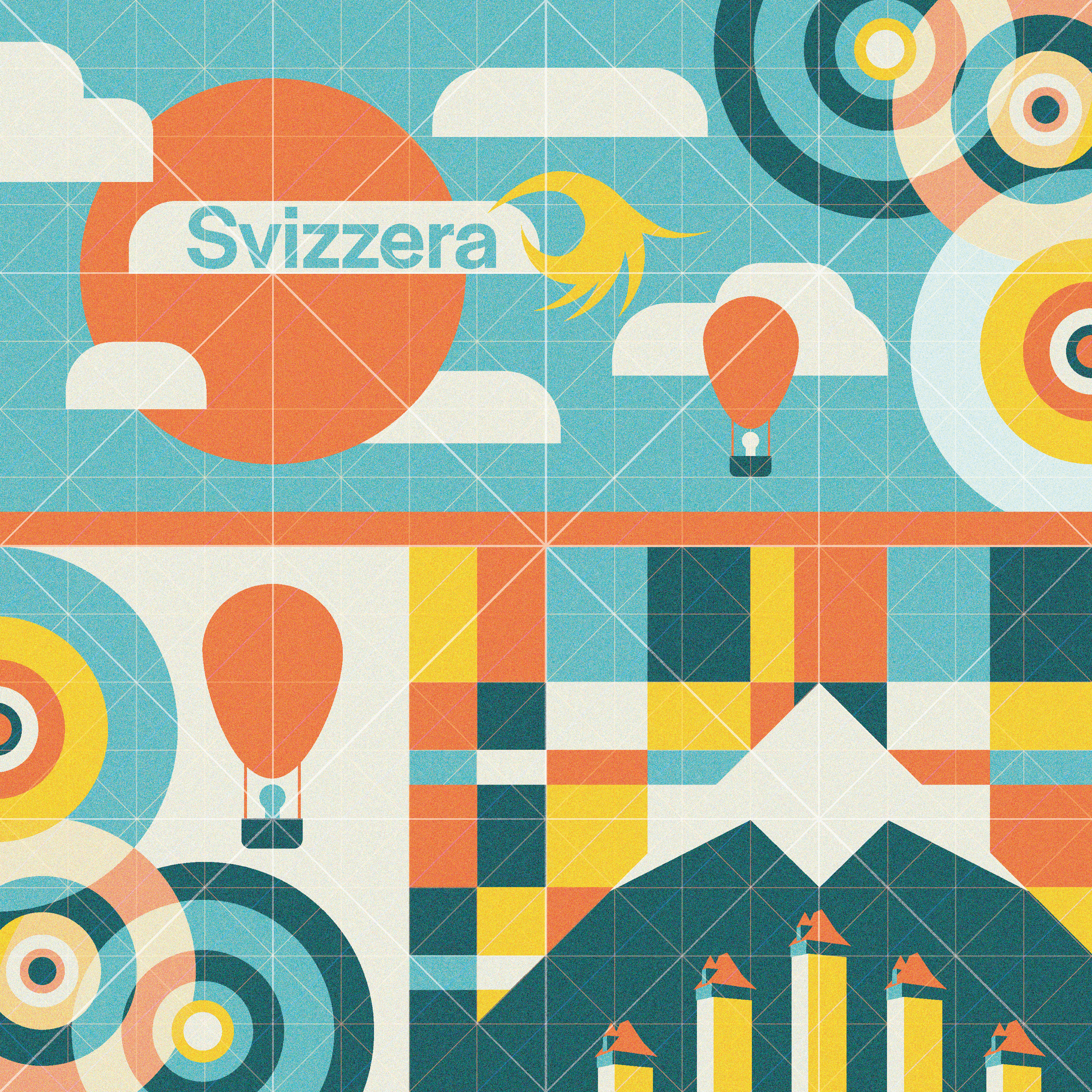
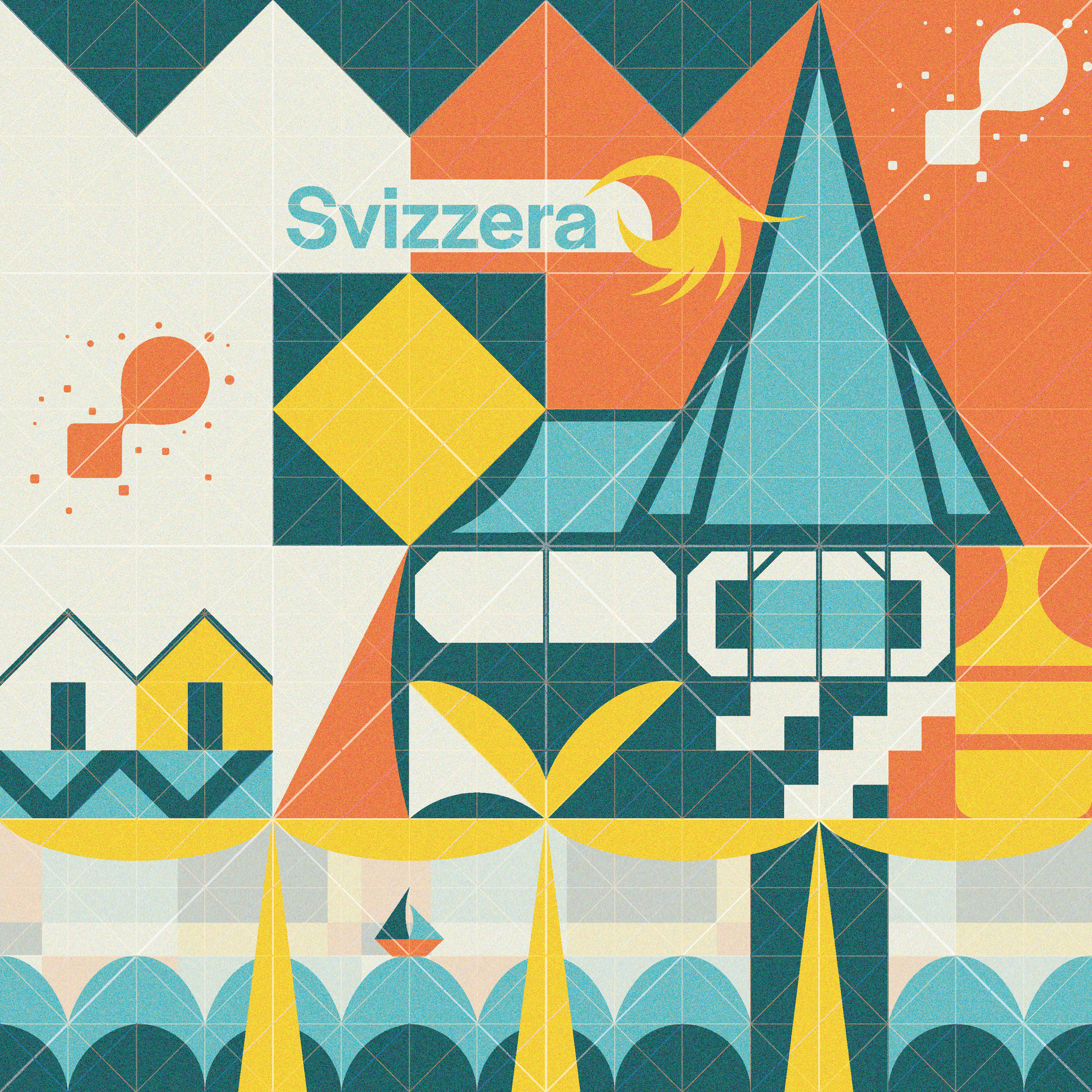
Grid systems are fundamental to all areas of graphic design. These illustrations are celebrating design and design history, so because of that I have made the grid a focus with this design by making the grid clearly visible to the observer.
Color Psychology
Color psychology is a branch of psychology surrounding the influence of colors on human mood and behavior. The human mind subconsciously reacts and interprets colors in a way that effects our behavior. If you want to create a color palette that attracts your target audience and accurately tells your brand story, it’s important to understand the psychology of colors. Here are the color associations with Svizzera’s color pallet. The Yellow evokes positivity, youth, joy, and playfulness. The orange is energetic and warm, most associated with creativity and enthusiasm. The bright blue calls to mind feelings of calmness and relaxation. The blue is important to offset the more energetic colors used in the design.