
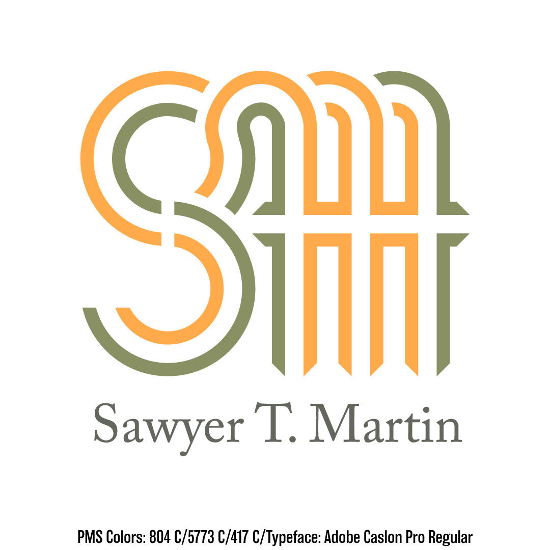
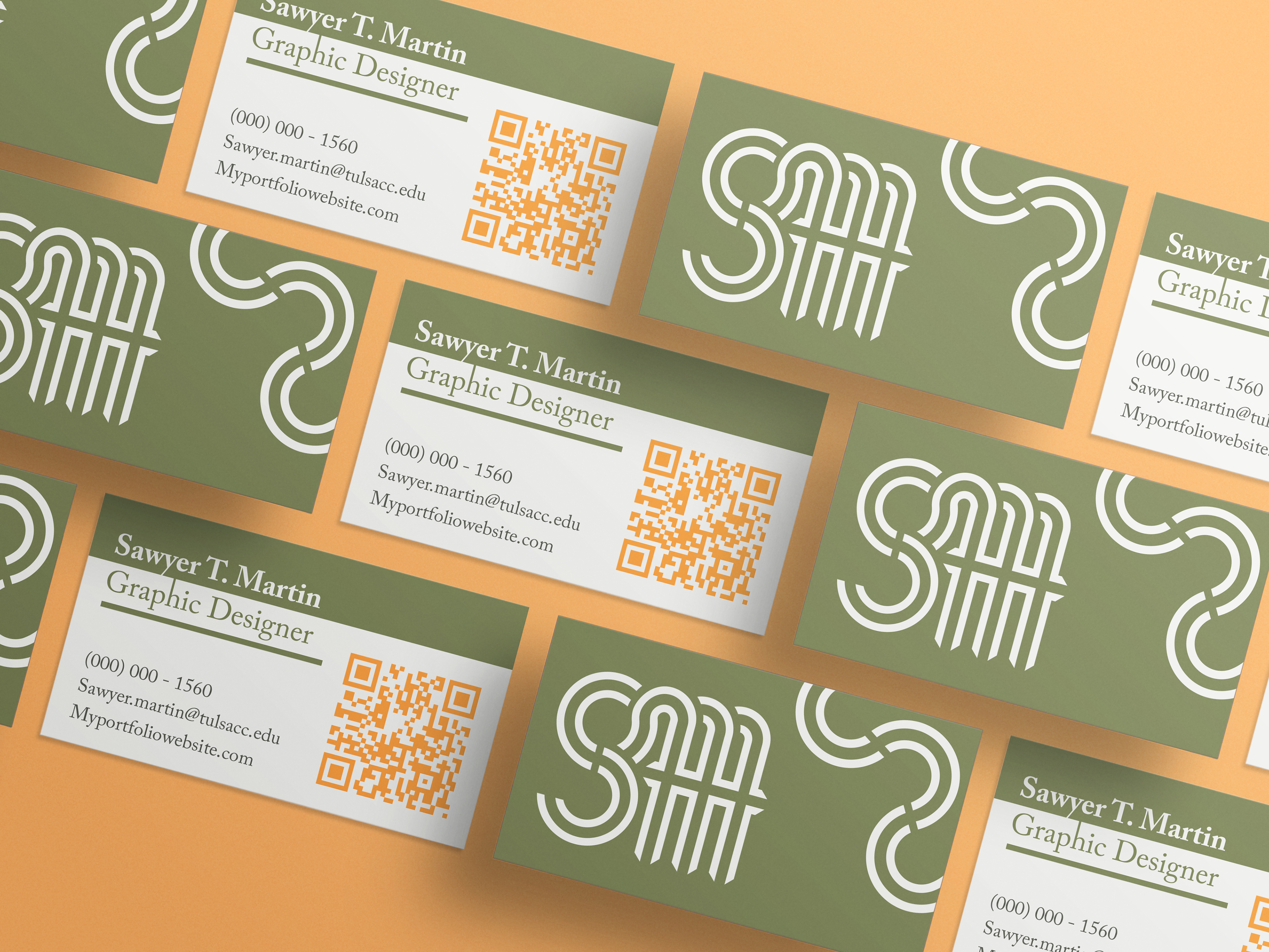
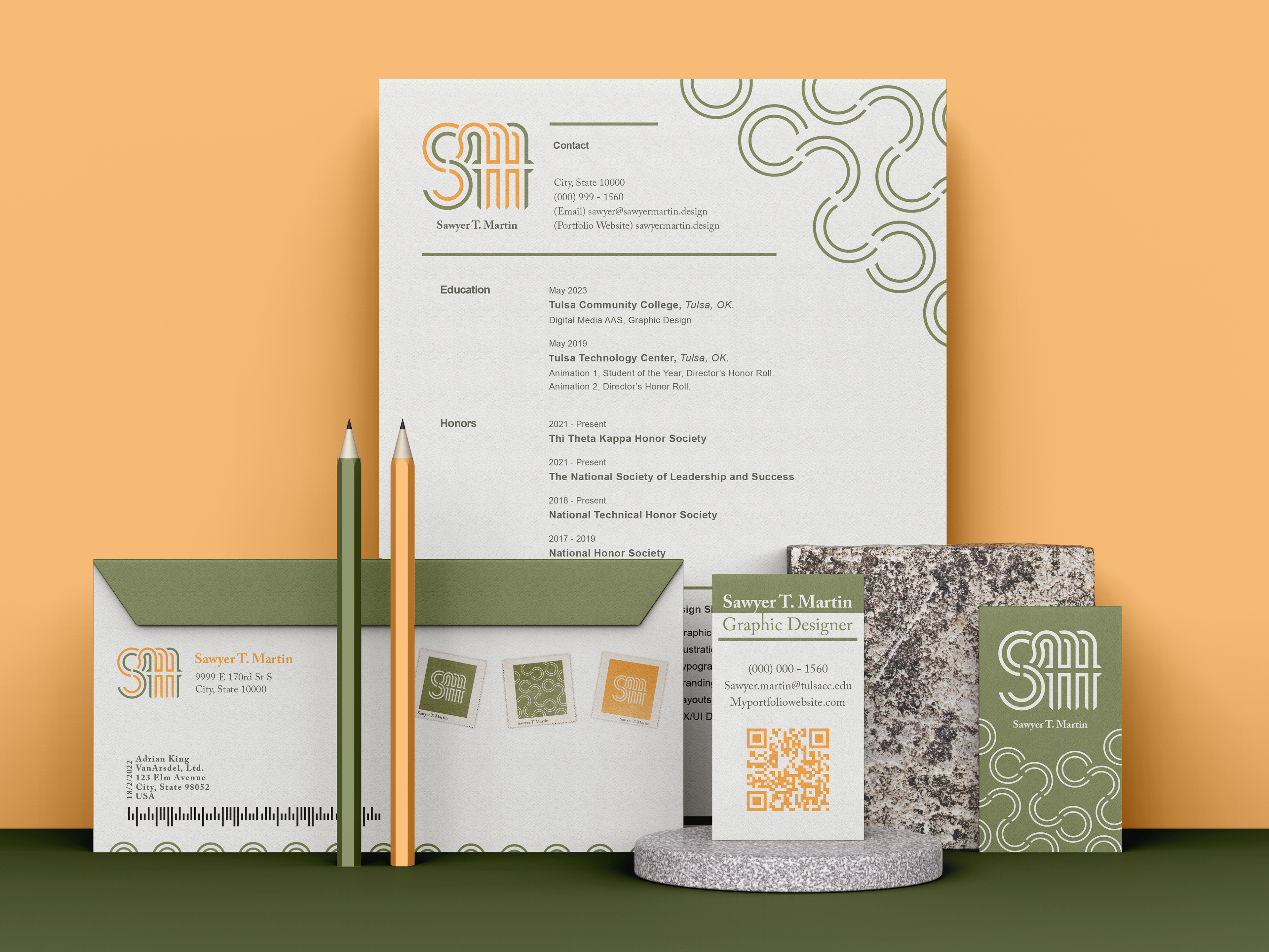
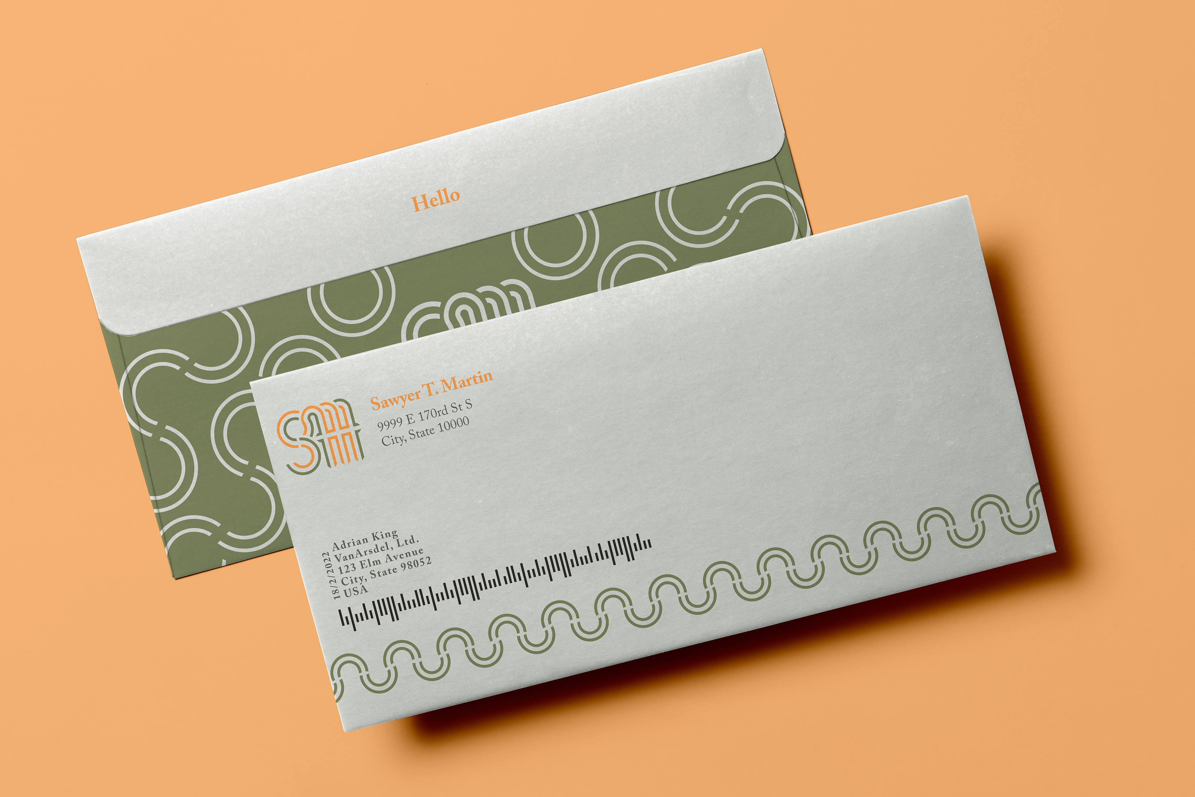
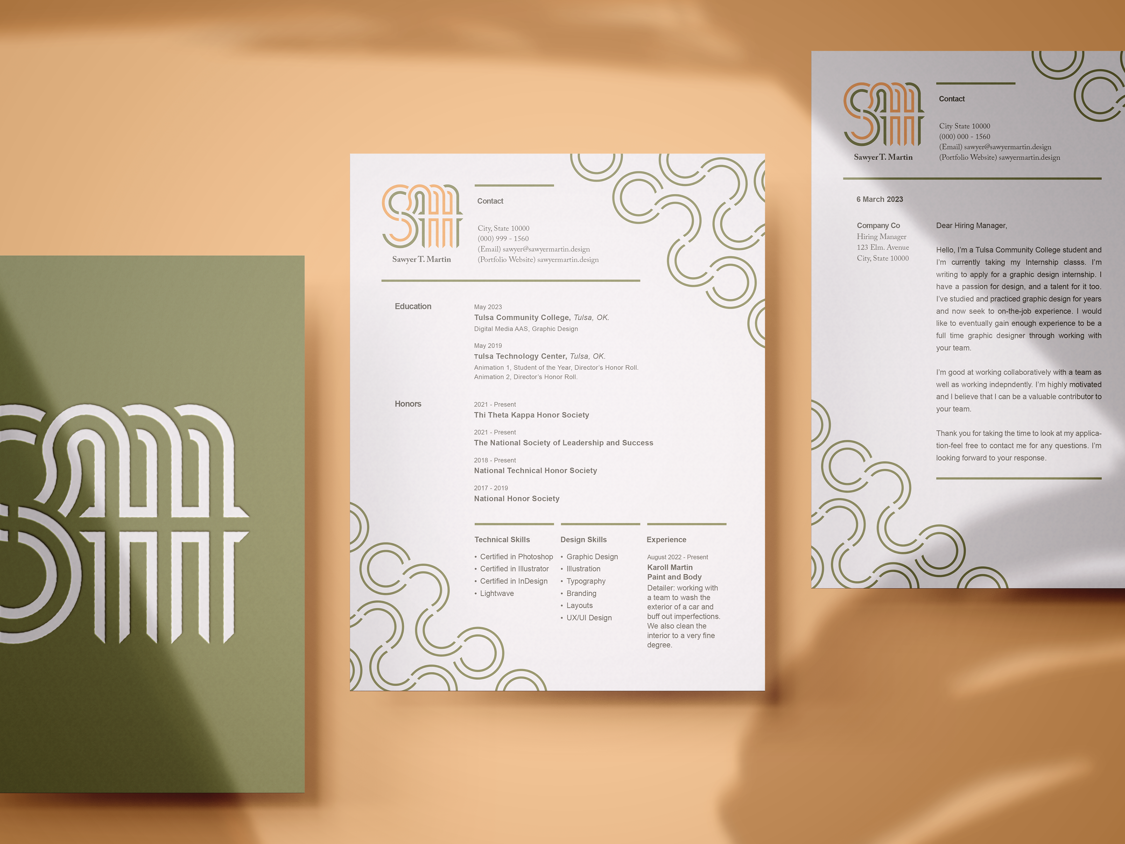
When one thinks of a brand identity most people will think of a logo. The logo is indeed one of the most important elements of a brand identity, but it is just one asset of a greater identity system. An identity system is the visual representation of someone’s brand. It is a collection of cohesively designed elements that work together to form how you see that brand visually. These elements come together to establish the brand’s tone throughout various mediums and formats, some other assets in an identity system include a color palette, typography, and any supporting elements such as a brand pattern. For my personal identity system, I have created a logo with a companion typeface, a color palette, and lastly a brand pattern to represent my brand in the form of an envelope, business card, and a letterhead.


Color Theory
Picking a good color palette is an important step in the design process. Colors have a lot of power to inform our emotions, mood, and thoughts. Using the color wheel can help a designer make an informed decision on a color pallet. By visualizing how each color relates to the color that comes next to it on a rainbow color scale, this can help a designer encourage aesthetic harmony. Using the color wheel to see how colors relate to each other we can discover many different types of color palettes such as Monochromatic, Analogous, Complementary, Split-complementary, Triadic, and Tetradic. So now picking a color pallet is no longer an arbitrary decision but rather an informed and researched decision. My personal brand uses a 2-color analogous color pallet. An analogous scheme is formed with colors that are located next to each other on the color wheel and aims to produce a color pallet with little contrast.